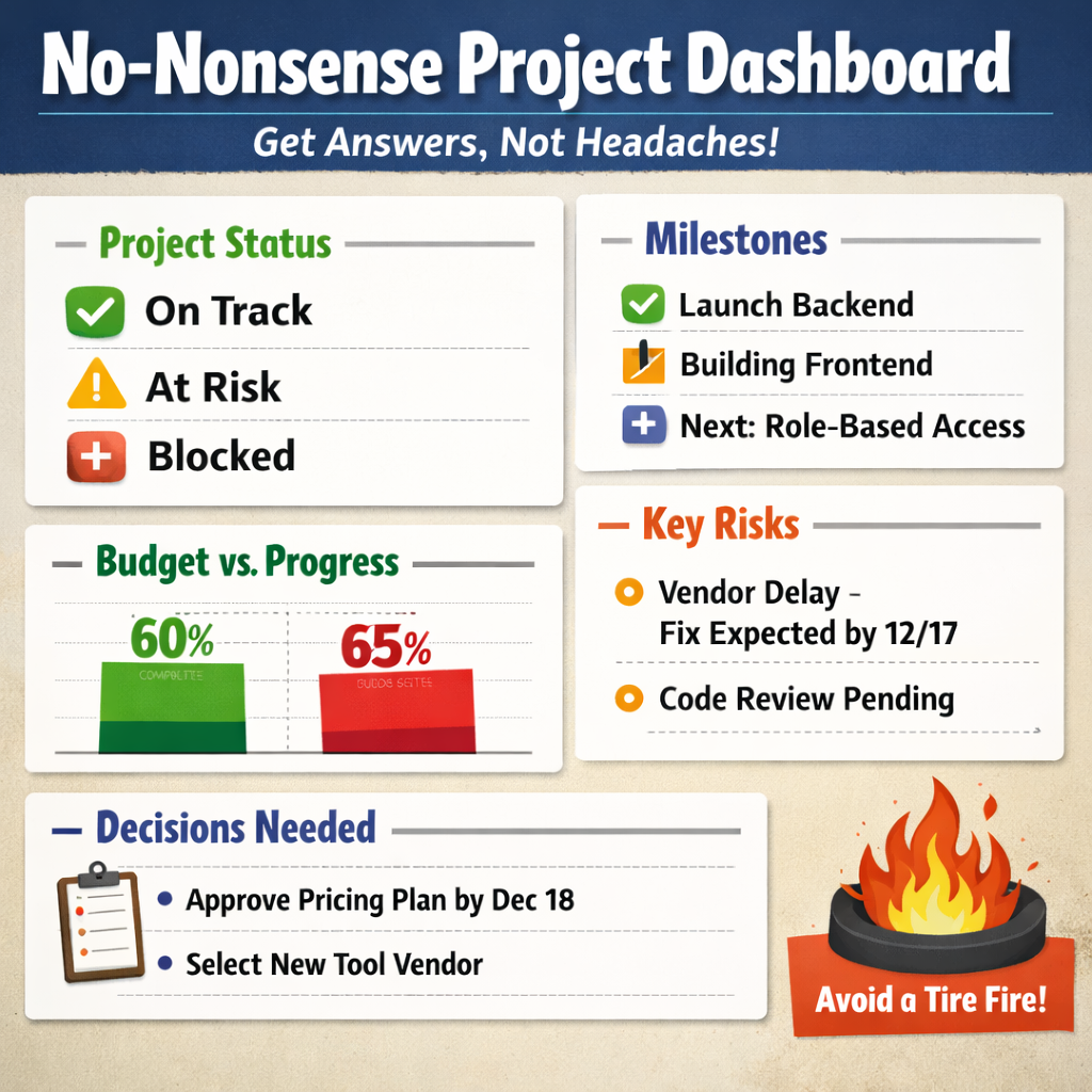
(Because “what’s the status?” should not require a decoder ring.)
Let’s talk about dashboards. Specifically, the kind that don’t make a founder’s eyes glaze over like a tax form.
You know the type I’m talking about. Those beautiful, color-coded monstrosities built by a PM for other PMs, complete with gradients, velocity trends, and a burn-down chart no one asked for.
Here’s the thing: founders don’t want to admire your dashboard. They want to use it. They don’t care how the sausage is made. They just want to know:
So let’s fix that. This post is your no-BS guide to building dashboards that actually communicate something useful to the people writing the checks. Remember, this is for founders, not your dev manager, QA director, etc.
1. Founders Want Answers, Not Art
Dashboards are supposed to make things clear. Instead, they often read like the cockpit of a commercial jet.
Founders don’t want to know how many story points got closed. They want to know if the thing they’re paying for is going to ship, or if they need to prepare a damage-control statement.
So: stop designing dashboards like you’re submitting them for an infographics award. Start making them founder-readable.
2. Dashboard Rule #1: Show Direction, Not Detours
Your dashboard has one job: signal.
If it needs a paragraph of explanation, it’s not a dashboard, it’s an excuse.
It should answer three questions. No more. No less:
That’s it. If your dashboard includes anything beyond that, make sure it’s not just there to justify your job title.
3. Must-Have Components of a Founder-Friendly Dashboard
You only need five things. Five. Not fifteen. Not “a dashboard per workstream.” Just this:
Project Health (RAG or Emoji, but Pick One)
Red. Yellow. Green. That’s it. Don’t get cute. No gradient oranges or blinking GIFs.
And for the love of clarity, don’t invent your own status terms. Use actual language:
Emoji? Fine. But keep it consistent. This isn’t a group chat. You need to be able to articulate change over time in a useful way. Not I went from thumbs up/down to acorns and automobiles.
Milestone Summary (Past / Present / Next)
No Gantt chart. No timeline that scrolls sideways forever. Just tell me:
Example:
Finished: Login backend
In Progress: Frontend auth + SSO
Next: Role-based access
Congratulations, you just communicated more than most sprint reviews. Now, sometimes leadership will want the gantt chart, if you need one, make it simple to articulate the three bullet-points above, what was finished, whats in progress, what is next and a high level relationship between them.
Budget & Burn Snapshot
Let’s not get academic. Founders want to know:
Are we spending money at the same rate we’re delivering value?
So show:
Side-by-side. In a bar. In a pie. I don’t care. Just don’t make them do math. And don’t you dare mention “EAC deltas” unless you enjoy being ghosted. Again, unless you have that nerdy founder. It does happen.
Key Risks / Blockers
Bullet format. Plain English. No MBA thesaurus.
Don’t say “external third-party dependency-related delay.” Just say “the vendor dev team is working through technical constraint, next update expected 12/17.”
And stop blaming issues on ambiguous reasons. If the sky is falling, just say so and let them know the next potential update. Don’t leave them in the dark with vague lip service.
Decisions Needed
This section is where you actually earn your salary. Put the calls to action here.
Bad example: “Leadership needs to weigh in.”
Good example: “Founders to approve pricing model by Dec 18 (assigned to [Name]).”
Because “someone should do something” is how things don’t get done. Be clear on what is needed.
4. Design Rules: Keep It Founder-Proof
If you build a dashboard that needs to be explained, you’ve failed.
Examples:
5. Tools That Actually Work for This
You don’t need an enterprise platform. You need something that works and doesn’t trigger a login spiral.
Here are tools that don’t suck:
Rule of thumb: if you need to onboard someone to view your dashboard, you’ve already lost. Also, if you have a PMIS tool like SmartSheet, Atlassian suite, these have native features for dashboards.
6. What to Leave Out
(Unless You Want Confused Slack Messages at 7am)
Please, just... don’t.
None of that belongs in a founder dashboard. That’s PM homework. Keep it in the project plan, not the comms layer.
7. Delivery: How and When to Share It
Great dashboard? Doesn’t matter if no one reads it.
Send it how they like it:
Cadence? Weekly or biweekly. That’s it. Anything more and you’re annoying. Anything less and you’re invisible. I will say, this dashboard should be dynamic, so sharing a link that they can look at anytime on top of the regular cadence snapshot is a great idea.
8. Final Thought: Dashboards Are for Signal, Not Show
This isn’t your Dribbble portfolio. It’s a tool.
The goal isn’t to impress. The goal is to communicate. Fast. Clearly. Repeatedly.
A good dashboard:
Keep it simple. Keep it visible. Keep it founder-proof.
They’ll thank you. Or at least stop asking, “what’s the status?”